Mastering the Market's Universal Language: From Candlestick Anatomy to Trend Analysis
From Zero to Pro: Master the psychology behind Candlesticks and identify real market trends at a glance.
Author: Mr.Forex
This Is Not a "Get Rich Quick" Guide
This book won't tell you exactly when to hit Buy or Sell.Its purpose is simple: to help you understand what those moving Candlesticks on your MT5 screen actually mean.
Trading without knowing Candlesticks is like driving without understanding traffic signs. This is your essential literacy course.
In the Forex market, price charts are the universal language.
Whether you plan to use Moving Averages, MACD, or Expert Advisors (EA), Candlesticks are the fundamental building blocks. They are the objective records of real money exchanged between global buyers and sellers.
Ready? Let’s dive into the basic symbols.
Global Standard Settings
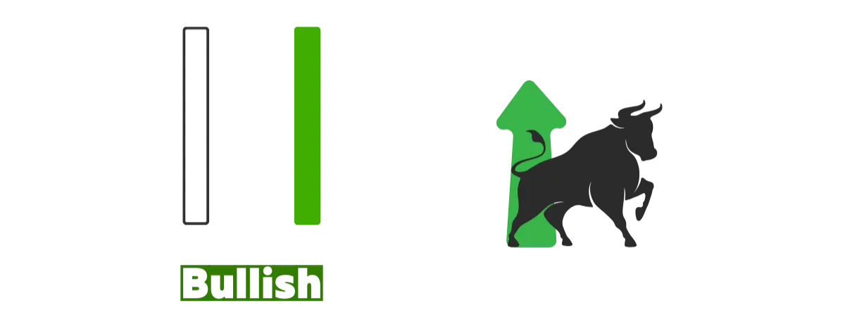
When you open MT5, you'll typically see two colors of candlesticks.Green / Hollow = Bullish
Definition: The closing price is higher than the opening price for that period. Buying pressure outweighs selling pressure.
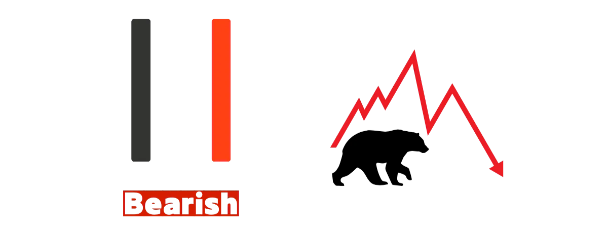
Red / Solid = Bearish
Definition: The closing price is lower than the opening price for that period. Selling pressure outweighs buying pressure.
Definition: The closing price is lower than the opening price for that period. Selling pressure outweighs buying pressure.
⚠️ Important Notes on Color:
1. Global Standards vs. Regional Habits
In international markets (Forex, US Stocks, Crypto), the default is usually Green for Up (Bullish) and Red for Down (Bearish).
This is the opposite of some Asian stock markets where red represents a rise. Beginners often mistake red for a gain, only to realize the market is actually crashing.
2. Customizing MT5 Colors
If you find it difficult to adjust, you can change the color scheme in MT5 via "Settings" > "Charts" to match your preference.
💡 Mr.Forex's Advice:
While you can change it, I recommend getting used to the "Green Up, Red Down" international standard.
Whether you're following professional global traders or reading Bloomberg news, this is the universal standard. Adapting early will broaden your global market perspective.
Anatomy of a Candlestick: The Four Prices (OHLC)
Every candlestick, whether it represents 1 minute or 1 month, is like a tug-of-war between buyers and sellers. The progress and outcome of this match are recorded by four key price points, known as OHLC.1. The Body: "Who Won?"
The thick, pillar-like section in the middle of a candlestick is called the "Body." Its color and length are determined by the relationship between the Open and the Close prices.Scenario A: Close > Open
Meaning: Like climbing stairs. The price at the end of the period is higher than when it started.
Result: Buyers win; the body is displayed in Green.
Insight: "Opened at 100, closed at 105." The price has increased.

Scenario B: Close < Open
Meaning: Like a slide. The price at the end of the period is lower than when it started.
Result: Sellers win; the body is displayed in Red.
Insight: "Opened at 100, closed at 95." The price has decreased.
Meaning: Like a slide. The price at the end of the period is lower than when it started.
Result: Sellers win; the body is displayed in Red.
Insight: "Opened at 100, closed at 95." The price has decreased.

Scenario C: Close = Open
Meaning: A draw. After a period of intense trading, the price returned to its starting point.
Result: No body or an extremely thin body, known as a "Doji."
Insight: Market indecision; buyers and sellers are evenly matched.
Meaning: A draw. After a period of intense trading, the price returned to its starting point.
Result: No body or an extremely thin body, known as a "Doji."
Insight: Market indecision; buyers and sellers are evenly matched.

Conclusion: The longer the body, the more decisive the win. The shorter the body, the tighter the race.
2. Shadows (Wicks): The Struggle
The thin lines above and below the body are called "Shadows" or "Wicks." They record the price extremes reached during the period—levels the market touched but couldn't maintain.- High:
The highest price reached during the period. - Upper Shadow:
Indicates price went up but was pushed back down by sellers. A long upper shadow suggests strong Selling Pressure. - Lower Shadow:
Indicates price dropped but was pushed back up by buyers. A long lower shadow suggests strong Buying Pressure (Support). - Low:
The lowest price reached during the period.

Trends & Ranges
When dozens or hundreds of candlesticks connect, they form a footprint of price movement. Despite daily fluctuations, the market generally follows three basic patterns:1. Uptrend — Climbing the Stairs
Visual: Price moves like it's climbing stairs. Even with occasional pullbacks, each new low is higher than the last, and each new peak sets a higher record.Technical Definition: Characterized by "Higher Highs (HH)" and "Higher Lows (HL)."
Insight: Buyers are in control. Look for buying opportunities and avoid trading against the trend.

2. Downtrend — The Slide
Visual: Price moves like it's going down a slide. Even with temporary bounces, each peak is lower than the last, and lows continue to drop deeper.Technical Definition: Characterized by "Lower Highs (LH)" and "Lower Lows (LL)."
Insight: Sellers are in control. The market is trending down; look for selling (shorting) opportunities.

3. Ranging — Walking the Corridor
Visual: Price bounces up and down within a specific range, as if trapped between a ceiling and a floor, with no clear direction.Technical Definition: Highs and lows remain mostly horizontal, failing to break out into new highs or lows.
Insight: Buyers and sellers are evenly matched. The market is consolidating or waiting for major news.

Support & Resistance
The market has a memory. Certain price levels act as psychological barriers where trends are likely to reverse.1. Support — The Floor
Definition: A level where the price struggles to fall further. When the price hits a certain point and bounces back up repeatedly, Support is formed.Psychology: "This is a bargain!" Buyers enter because the price is low, and short-sellers take profits, combined pushing the price back up.

2. Resistance — The Ceiling
Definition: A level where the price struggles to rise further. When the price hits a certain point and drops back down repeatedly, Resistance is formed.Psychology: "This is too expensive!" Holders sell to take profits, and new sellers enter to short the market, combined driving the price down.

💡 Mr.Forex’s Pro Tip:
Think "Zones," Not Just LinesMany beginners stress over whether to align lines with the wicks or the bodies.
Remember, Support and Resistance are usually Price Zones. The price might briefly "pierce" the zone before pulling back. As long as the reversal happens within that area, the level is valid.
Next: Learning When to Buy and Sell
Congratulations! Now when you open MT5, you're no longer just staring at random lines. You know green means buyers won, wicks represent pressure, and you can spot the "ceiling" and "floor." You've built a solid foundation for technical analysis.But a foundation is just the start. To trade effectively, you need a set of "rules" to guide your entries and exits.
Head over to the next article, where we'll use two essential tools to help you build your first trading Standard Operating Procedure (SOP).